Wireframing website copy for product people
7 min. readWireframing your website copy invites discussion, removes guesswork, and lets you show your team that you did your work and are ready to back it up.
As a product person you wear many hats every single day.
You might write content for your website in the morning, then move on to answering emails, then again to designing a new feature. Just to finish it all up with brainstorming a solution to a problem that’s been on your mind the whole day.
It’s a lot.
And to top it all off, you have to also explain — to the whole team — what you’re working on and why it’s important.
Writing is a big part of a PM’s role, and when you can’t combine your design chops with effective, conversational writing, getting your team on board with your ideas becomes yet another tedious, challenging item on your to-do list.
If you're building something like a product, if you can't get people inside of your company fired up about it, then how are you ever going to get somebody who has no relationship with you or no knowledge of you to care?
— David Gerhart, Chief Brand Officer at Drift
Why should you learn how to wireframe your website copy?
Working both on my own as a conversion copywriter, then with an agency as a UX designer and then as a jack of all trades at a usability testing startup, I’ve seen and tried a lot of things.
And I have to say, I don’t envy product people.
You know that both UX and marketing copy are important (and are desperately trying to convince everybody else about it), but when it comes to the actual in-the-trenches work, every time you share your sketches or Google Docs — hoping the words you so meticulously mulled over get excited nods — it’s a leap of faith.
You know you need more people to know about your product, but that top-of-the-funnel website copy never seems to get the attention it deserves.
What can you do about it?
You can learn how to wireframe your copy.
As a copywriter myself, I can tell you wireframing is our secret weapon to get better results out of every word we write.
A wireframe removes a lot of the imagination work. And that means the client can focus on real feedback, not guessing.
— Joanna Wiebe, Founder at Copyhackers
Wireframing helps you in multiple ways:
- You are able to talk confidently with the stakeholders or the designer about the whys behind your work.
- Designers are less likely to interpret, change, and move copy around.
- You realize when a piece of copy doesn’t fit and when you should edit it.
- You understand whether the copy flows well section after section.
- You think more carefully and critically about the words you write and the visual elements supporting them.
- You help the other party visualize the final copy and save yourself hours on pointless edits.
Wireframing copy as a skill is not only invaluable for your execs and team, but for your career.
PMs who are comfortable with words and skilled at writing will have less trouble transitioning in and out of the different roles. Seek out those experiences wherever and whenever you can. Getting more experienced in those areas will not only help you at your current job, but it will also potentially open up other career paths for you later on in your work life.
— David Schumann, PM at Minute Media
That's because when you present your copy in wireframes, you show others that you thought about every single detail and are prepared to back it up, line by line.
That's how good converting copy should work anyways, right?
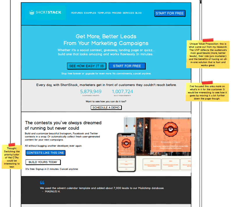
And if you're still not convinced, let legend copywriter Claude Hopkins tell you about the importance of visual elements with copy and avoiding guesswork:
One ad is compared with another, one method with another. Headlines, settings, sizes, arguments and pictures are compared. To reduce the cost of results even one per cent means much in some mail order advertising. So no guesswork is permitted.
— Claude Hopkins, "Scientific Advertising"
What tool to use?
There are a few tools you can use to build your wireframes. What you use depends on the type of project you’re working on, your final goal, and your skills.
Hand sketching on paper
Hand sketching has been the most basic tool for UX designers and product managers to work on and brainstorm ideas about user flows and interactions. Using your hand gives you the freedom to not think about how to use a tool, hence when the best ideas pop up.
When it comes to wireframing for copy, hand sketching might just be an unnecessary step. Your copy will be dictated by research and sketching implies you come up with a structure to place the copy in.
With wireframing you work the other way around. Copy first, then structure.
Still hand sketching can be a quick useful tool when writing copy for bullet points or paragraphs just to give you an idea for how to showcase it on the page (i.e., is this copy better in 4 horizontally aligned blurbs, or should it be 2 and 2?).
Balsamiq
Balsamiq deserves its own category. It’s purpose-built for low-fidelity wireframing and it's easy to learn and use. Creating your first wireframe in Balsamiq might literally just take you a few hours — from scratch.
It removes all complexities and nuances of high-fidelity design software, while still giving you what you need to sketch the layout of your copy. And it conveys your strategy to the designer efficiently. You can choose between a hand-drawn sketch feel and a more polished, clean one.
Low fidelity tools
There are options available for creating low-fidelity wireframes that you may not have considered. Tools like Keynote, Powerpoint and Google Slides can quickly generate visual representations of your ideas.
High fidelity tools
These are tools like Sketch, Figma and Adobe XD (or Illustrator/Photoshop).
While you’d be able to create pixel-perfect mockups of any web page, chances are you might not have the skillset nor time to learn how to use them properly and efficiently.
In wireframing copy, the first thing you should focus on is being efficient. You can’t spend an hour designing a button. Obviously these tools have ways to help you out, but the learning curve can be steep for someone who’s not designing on a daily basis.
Another aspect to consider is the amount of freedom these platforms provide you with. Too much. To the point you might end up over-designing your wireframe — instead of keeping it simple so people can focus on the copy.
I would always recommend you try at least 2 or 3 tools and pick the one that works best for you.
What I wish I knew when I started wireframing
I first started wireframing a bit after I learned copywriting. I was lucky enough to stumble on Joanna Wiebe’s (Copyhackers) work and I became a believer in conversion copywriting.
That said, my very first wireframes were pretty bad.
There was not really much consistency, not enough white space, alignment was often not great, I used too many colors, and there was no such thing as margins or padding for buttons. All of this contributed to taking the focus off the copy and into the flashy but awkward layout.
It's all about making your copy stand out while giving enough direction for how the content should be consumed.
Learning and practicing the basics of good design + copy will put you in the top 10% of product people out there. And it will help you communicate more effectively with designers/developers when needed.
One concept that comes to mind is what artist Scott McCloud talks about in his book "Understanding Comics": amplification through simplification.

How can you amplify the meaning and persuasiveness of your copy with design? Let’s find out.
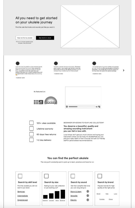
As an example, I’ll use real wireframes from a client project I’ve been working on recently (a Ukulele eCommerce website).
White space
White space lets your design breathe and helps you point out important information or visual elements. It’s also what helps you group elements that are supposed to be seen as together and separates the rest. It creates context and makes it easier for users to digest your copy.
Two helpful rules I've learned from Erik Kennedy when it comes to white space:
- Double it (always err on the side of more).
- Fail left and fail right first (before settling, try with too little white space and with too much first, then find the balance.

Alignment and visual hierarchy
Alignment makes your design easy to read and skim.
Visual hierarchy helps users understand what they should read and in what order.
Combining good alignment and visual hierarchy takes some practice and experimentation to get right. As a product person you shouldn't obsess over the details, but practicing will surely make this work come almost as second nature.

Consistency
Being consistent with all the previous design principles makes your design look thought-out. In turn your team will trust your work and process more. As a product person, it’s all about selling your “why”.

A few rules of thumb to create consistency in your wireframes:
- Create predefined text styles for your headlines and crossheads. For example, your main headline (h1) might be 50 pixels, your h2 crosshead 32 pixels and your h3, 28 pixels. When adding new ones, keep coming back to these sizes. Try not to use too many: 2 or 3 is fine.

- Prepare templates for the most common objects or groups of objects you usually wireframe. These can be cards, reviews/star rating, hero section with CTAs, primary and secondary CTA buttons, icons and image placeholders, etc.
This is in my opinion one of the biggest advantages of Balsamiq over high-fidelity tools, as you already have most of these individual components ready to use (and you can also create your own Symbols, which are a group of controls to reuse across your wireframes).

There are plenty more UI and UX design principles out there, but when you get white space, alignment, visual hierarchy, and consistency right, your wireframes will make your copy stand out and help your clients/team trust your process.
For seeing some of these principles put into practice, I always recommend an “oldie” video tutorial by copywriter Joel Klettke. It’s educational and entertaining at the same time.
Note: If you liked this article, check out the follow-up called How to Wireframe Your Website Copy. A Step-by-Step Guide.
 By Christopher Silvestri, Conversion Designer & Copywriter. Questions or feedback? Connect with him on X or LinkedIn.


