New Art Search Experience!
We’re very excited to announce the launch of our brand new online search experience. Our on-going goal is to make it easier to find and connect with great art, and our new art search platform is another step on that journey.
Under the hood, we’ve rebuilt the ‘guts’ from the ground up. The reason? Our collection is huge, putting an extraordinary number of artists and publishers at our literal fingertips. But we didn’t want it to feel like searching for the right piece of art was like looking for the world’s smallest needle in the world’s largest haystack. Instead, we wanted art searchers to be able to dial right in and find exactly the kind of art being sought.
But more than that. We also wanted to be able to expose people to new art ideas and concepts that are related to what they’re looking for. When working with a client, we take our role as art mentor and guide seriously. We wanted our new art search platform to serve as an extension and reflection of our human design team’s expertise.
You’ll also notice a completely new look and feel, thanks to a brand new user interface. We want searching for and exploring art to be fun and exciting.
To get the most out of the new experience, here are some quick tips:
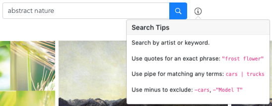
Our new search is very robust and very flexible.
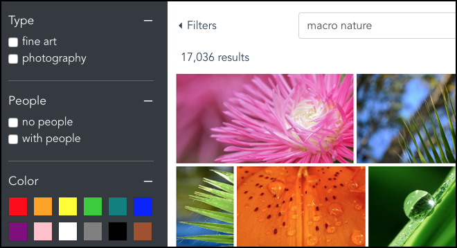
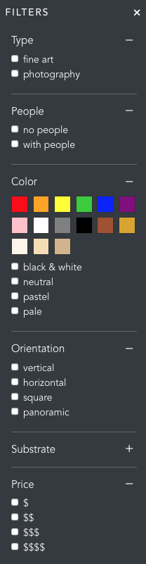
We’ve also expanded our search filters! To access them, just click the ‘Filters’ show/hide button in the upper left hand corner.
You can filter by:
Enough reading about it already! Go check it out for yourself! Happy Arting!