Customizing controls via text
Many UI controls, such as Button, Label or DataGrid, have text in them. To edit the text, double-click on the control and start typing. Or, if you have the control selected, hit ENTER or F2 to start editing. To commit the text you typed, click anywhere other than the text field you typed in or hit ENTER or CTRL/⌘+ENTER. If you want to discard the text changes you just made, hit ESC.
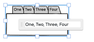
Some controls use certain characters as separators. For instance, to create multiple tabs in a tabs bar, you separate them with a comma.
A space character separates tags in a Tag Cloud control. Some other controls, like the Tree Pane, use other characters altogether. In such cases the default text for the control includes explanations on how to use it.
When editing text in a Label or Paragraph control you will see a small number in the lower-right corner of the editing box. This is the number of characters, which can be useful for copywriting or other purposes.
Basic formatting
Text style
You can use the following notation to format only certain parts of your control's text.
- for italic, use _this notation_
- for a link, use [this notation]
- for bold, use *this notation*
- for greyed out, use -this notation-
- for underlined, use &this notation&
- for strikethrough, use ~this notation~
- for color, use {color:#FF0000}this notation{color}.
- for font size, use {size:16}this notation{size}
All of the above syntax works around words separated by white spaces, and underline will work within words.
1. The #FF0000 above is the color in HEX form, just like HTML. The macro will work with or without the pound sign. You can also use certain color names (green, yellow, etc.) which you can find by moving your mouse over the colors in the color palette in the Property Inspector.
2. See the next section for how to turn [linked text] into functioning links to websites or other wireframes.
3. This formatting syntax also works for text entered into the Notes panel except italic and strikethrough.
Here's a screenshot of what the above text looks like in a Paragraph control, for instance:

The shortcuts will work almost everywhere where it makes sense, and you can combine them, so to make an italic link use [_this_] or _[this]_.
Some controls like Paragraph or Label allow you to "unbold" the text via the Property Inspector panel. If you do so, the words you *bolded* will stay bold. A few controls use bold text by default, so bolding text within those controls won't make a difference.
If you want to show these special formatting characters as actual text, you can escape the *, _, -, [ and ] characters with \*, \_, \-, \[ and \], so if you want to write "this [is] some text" and don't want the "is" to become a link, just type "this \[is\] some text".
Line breaks
Most controls allow you to insert a line break to wrap text from one line to the next. You can do this by writing \r in front of the text you want to start on a new line. Check out the example below where a line break is used in the second item in a Radio Button control.

Bulleted lists
In a paragraph control, you can create a bulleted list by preceding text with either a hyphen or an asterisk followed by a space.
* item 1
* item 2
- item 3
- item 4
Making links in text actually work
If you are using the link notation above (e.g., [this is a link]), you can turn link-formatted text into actual links using markdown syntax.
To do this, add the link destination in parentheses immediately after the link text. The link destination can be a URL or the name of another wireframe in the same folder. All the following formats are valid.
Web addresses:
[Google Home Page](google.com)
[Google Home Page](www.google.com)
[Google Home Page](http://www.google.com)
[Google Home Page](https://google.com)
Wireframes in the same project:
[Features Page](features)
Adding links in this way will cause them to show up in the Property Inspector as well, as shown below.
This text

results in

You can link specific strings of text as well as the whole control.
Note: If the whole control is linked, text links will be disabled. If the whole control is subsequently unlinked, the previous text links will return.
More macros
Lorem
Type lorem in a Paragraph or Text Area to use our Lorem Ipsum generator.

{Mockup-Name}
Type {mockup-name} (all lower-case) in a Label, Text, Title or Subtitle control to show the current wireframe name.
Placeholder text
Another option for creating placeholder text, besides the Lorem Ipsum text generator, is to use the Squiggly Line of Text and Squiggly Block of Text controls in the UI Library.

Note: Read about drawing these controls directly on the canvas to learn how to add them really quickly.
You can convert them to real text at any time by editing them and entering some text or by double-clicking each control, as shown below.
